

How might we design a high-fidelity Shot of Onboarding?
Aspired is a food ordering app/ website for nonprofit supporters.
Users can browse, search and order food based on their location. Customers are invited to use the app by the non-profit, which is exclusive to the Aspired business mission. I worked in a team of myself and two amazing UX Designers.
My Role
UXUI Design | Graphic Design | Project Management
Team
Andrea Quintana
Clory Luo
Deliverables
User Interviews, Competitive analysis, Workshop, User Flow, Onboarding flow, Checkout Redesign, Prototype, Usability Testing.
Problem
Aspired founders shared that their customers were having difficulty understanding the core value of the business. Also, previous checkout design work was not validated through usability testing. This led stakeholders to identify problems such as repetitive features.
Create a Clear Onboarding: users can understand the value and business goal at first glance.
Concise Checkout: short and transparent
Goals
Initial Steps
Project management and Interviewing Stakeholders-Learning from the founder and previous design team.
I organized the Team Deliverables Proposal to set up the project timeline. Then I managed availability documents for members to follow later.

Andrea and I interviewed the Aspired founder and previous designers to understand better-Aspired business goals, persona, the background of the company, and user goals.
Key Takeaways
Aspired persona is unique, they find out about the business through a nonprofit.
The website checkout experience was their main priority. It is not consistent with the mobile version.
Secondary Research
What is out there in Onboarding/Checkout?
We wanted to understand what makes an effective/successful onboarding experience and what users need to achieve their goals.
Key Takeaways:
Onboarding is essential when there are unique features
Most popular traditional onboarding styles, ex: Function-oriented, benefit-oriented, Progressive onboarding
Long onboarding flows show a decrease in signups
Contextual user research shows that there is an increase in sign-ups.
Provide an obvious way to move forward
Remember to celebrate success with the user
Top Companies Turn to phone verification
Competitive Research
We researched different food checkout flows to recognize trends and industry-standard features. It was interesting to find common patterns like the 3-4 screen step process, one-click checkout, and autofill features from Uber eats, Grub Hub, and Postmates.

Found that the UberEats checkout experience was best overall among food ordering apps according to digital trends
Primary Research
We interviewed 7 participants in total, these participants were selected from a screener that we created based on Aspired user persona which is a persona that is currently donating to a nonprofit and orders food from food delivery apps.
The objective was to understand how our users move through the purchase process to support a non-profit and understand users’ confusion/obstacles. Then, we introduced two onboarding screens and conducted A/B testing to see what experience people choose after experiencing the app.
Defining the problem & Brainstorm session
After the interviews, we started organizing our findings, we sorted these into groups based on high-level issues of the current product.


We created an affinity map as a team and identified four user stories. These insights helped us understand our next steps to design.
User Stories: These led us to recognize the user's goals and motivation when entering the app and validate the user’s problem.
I want to donate through ordering food and sharing my donation
I want to support my favorite nonprofit
I want to understand how my purchase contributes to my non-profit
I want to find local restaurants that donate to my favorite non-profit
These led us to recognize the user's goals and motivation when entering the app and evaluate the user’s problem.
Design Process
Mapping out the user’s path
We created a user flow to display the complete onboarding path/checkout a user takes when first entering Aspired. This helped us visualize the order of steps and what is essential for the user to take.

Medium Fidelity Wireframing For Onboarding
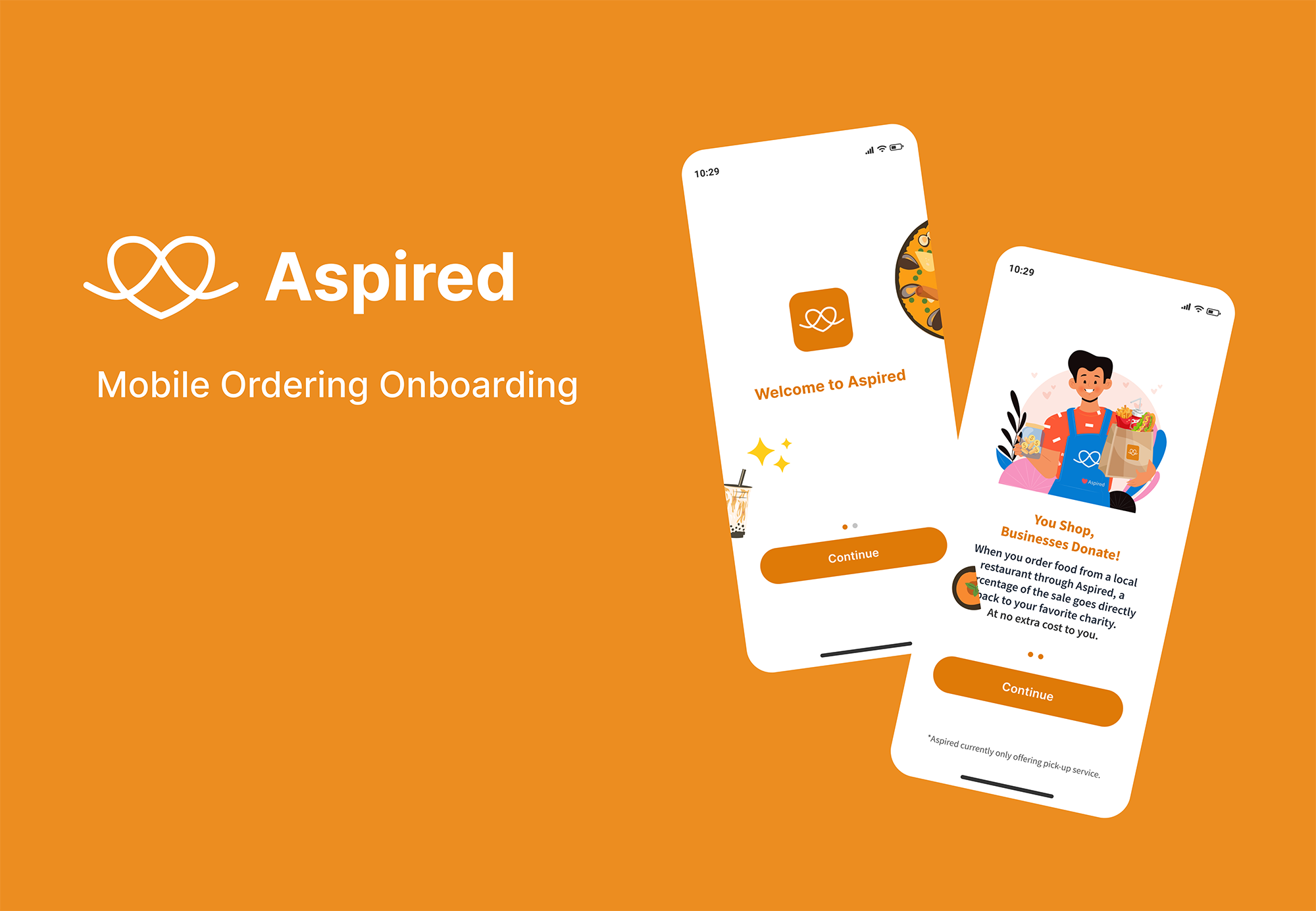
Based on secondary and primary research, we determined that the onboarding experience should consist solely of screens that communicate to the user the value of using Aspired and align with the user's goals, such as a company mission, description screen, phone sign-up process, and a location prompt to find local businesses.
“Get rid of everything that interrupts the user from the product value.”

Onboarding High Fidelity

Checkout Redesign
Timing is key when checking out, In order to improve the current checkout process further, we analyzed the current design and used insights from our user research.


Sharing our insights to Aspired
Medium-High Fidelity for onboarding/checkout was presented to the founder. After going over our design decisions, our project scope evolved due to time constraints and the company's timeline. Once feedback was given and our designs were approved, we were ready to design high-fidelity mockups.

Validate
We interviewed 6 participants that aligned with the Aspired mission. The research was organized in an excel file and grouped as trending topics.
All of the participants understood the flow
It was easy to follow and understood the benefit of the app.

Conclusion
Previous design work of the onboarding experience made it difficult for users to understand the company’s core values. This was due to not highlighting the user’s benefit/goals and unclear UX writing. Our approach to solving this problem focused on prioritizing users’ needs by creating an emphasis on what is the benefit for the user and allowing them to find local restaurants easily. These designs were validated and received positive feedback.
Next Steps
We see potential in doing the third round of testing with Aspired current customers to see if they understand the benefit of the app clearly. Also, creating a high-fidelity mockup for checkout to test our user’s barriers in completing this task.